Paul Farrell x National Theatre

Paul Farrell x National Theatre

  |  

More posts

Introducing our new exclusive range 'Behind the Scenery', designed for the National Theatre by Paul Farrell. We spoke with Paul about the collection, the development processes and the design inspiration behind each piece.

The design features a cross section of the theatre revealing the skills within – what inspired you on your visit to the National when you got a chance to glimpse behind the scenes?

What inspired me was the sight of so much industry and the variety of trades that all had their own department and workspace.

I wanted to illustrate this as a reveal where each skill set was compartmentalised, yet all working closely together in the same one big, connected location. Literally it was a case of being behind the scene(ry) where it all happened.

Who are your biggest design heroes and why or how do they inspire you?

These people are all creative heroes of mine for the very different and inspiring way they view their world.

Firstly, David Hockney, for his joyful ultraviolet vision and how he colours in every day with such natural confidence.

Paul Rand, as a true defining graphic illustrator who managed to
interpret each brief with simplicity and artful direction.

Tom Eckersley, the perfect graphic poster designer and advertiser’s dream, and a lesson on how to be the best graphic communicator.

David Gentleman, illustrator, for his artistic depiction of landscape and general life - traditional techniques expertly applied to modern day items, including postage stamps.

Collecting stamps has influenced my work and process - sets of imagery that had to be simple to work on such a small area. 

Tell us more about the design of this piece and how you developed it. We’d love to hear more about your creative process.

Once I had decided that each skilled trade had to be included, the challenge was to illustrate each with a simple mark or icon. The collective design, featuring them all, needed to be simple, so each icon could not be too complex. The final design is a cross section of a suggested National Theatre building and it became a task of piecing together each illustration and it’s position among all of the others. To make it more legible I kept the style minimal with line work and a limited colour palette. It simply grew and grew and it was an enjoyable exercise including each trade and constructing the artwork.
The visual idea formed early on, so what followed was a methodic process of simplifying each skilled trade over many versions, until it was simplified enough and also complimented the other represented skills. It was a process of evolving the work over time and this was easily achieved using Adobe illustrator crafted on a large work space on my desktop Apple iMac.

Like a giant construction, I wanted the pieces of the illustration to have the option of being disassembled. With many different products to apply it to, the overall designs had to be adaptable to different areas. Each product meant rearranging the separate illustrations, but this also enabled more variety and an opportunity to introduce new illustrations.

Can you recommend a book (either fiction or non-fiction) that has inspired you to think differently?

‘Growing Vegetable Soup’ written and illustrated by Lois Ehlert. Such an ingenious and simple way to illustrate a process and activity. A colourful children's picture book that teaches young readers about gardening by following a child and their dad as
they plant, tend, harvest, and cook vegetables to make soup. A simple cut paper style lends itself so well to help make this easy to follow read. It’s a lesson in charming simplicity and very different solution to cookbook design and always encourages me to rethink a brief.

Could you see yourself creating costumes or painting props? If you could work in one of our creative departments which, would it be and why?

My chosen creative department would have to be the armoury. Firstly, I’m fascinated by the fact that there is one at the National Theatre and secondly it’s a subject that has interested me ever since I was very young. I’d hope to design the most elaborate modern suit of armour with a decorative helmet and using a variety of coloured metals. I’d dedicate it to nature adorned with scenes of animals and landscape and give it a title.

One of our design heroes Ken Briggs designed many of the National’s most iconic poster designs. Which classic poster from our collection would you choose as inspiring to you and why?

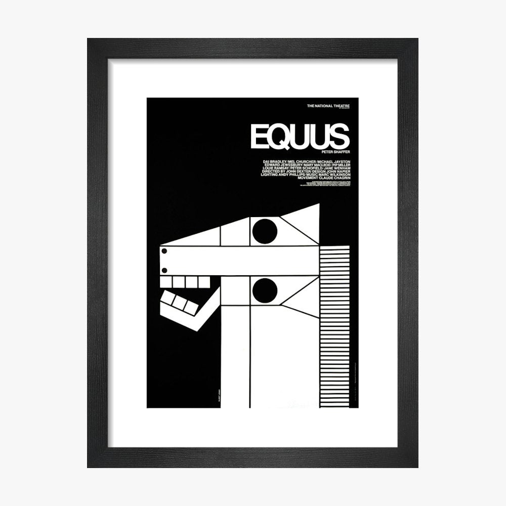
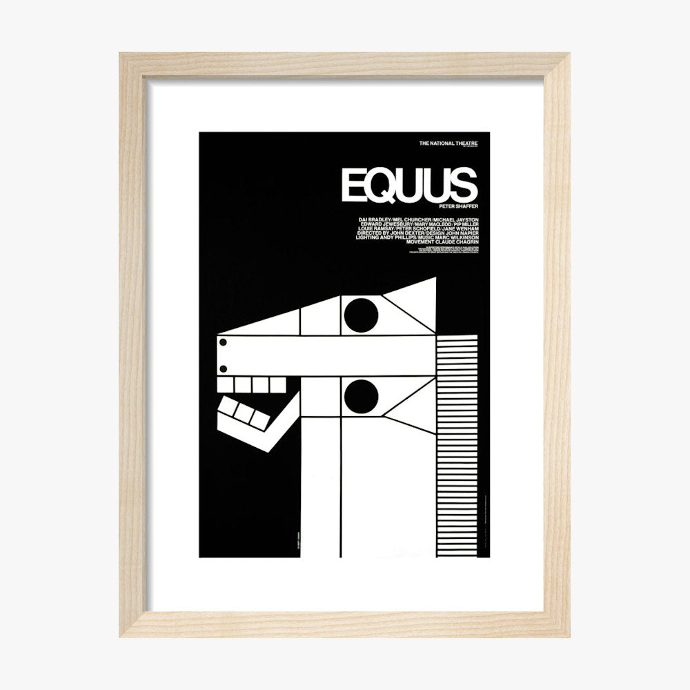
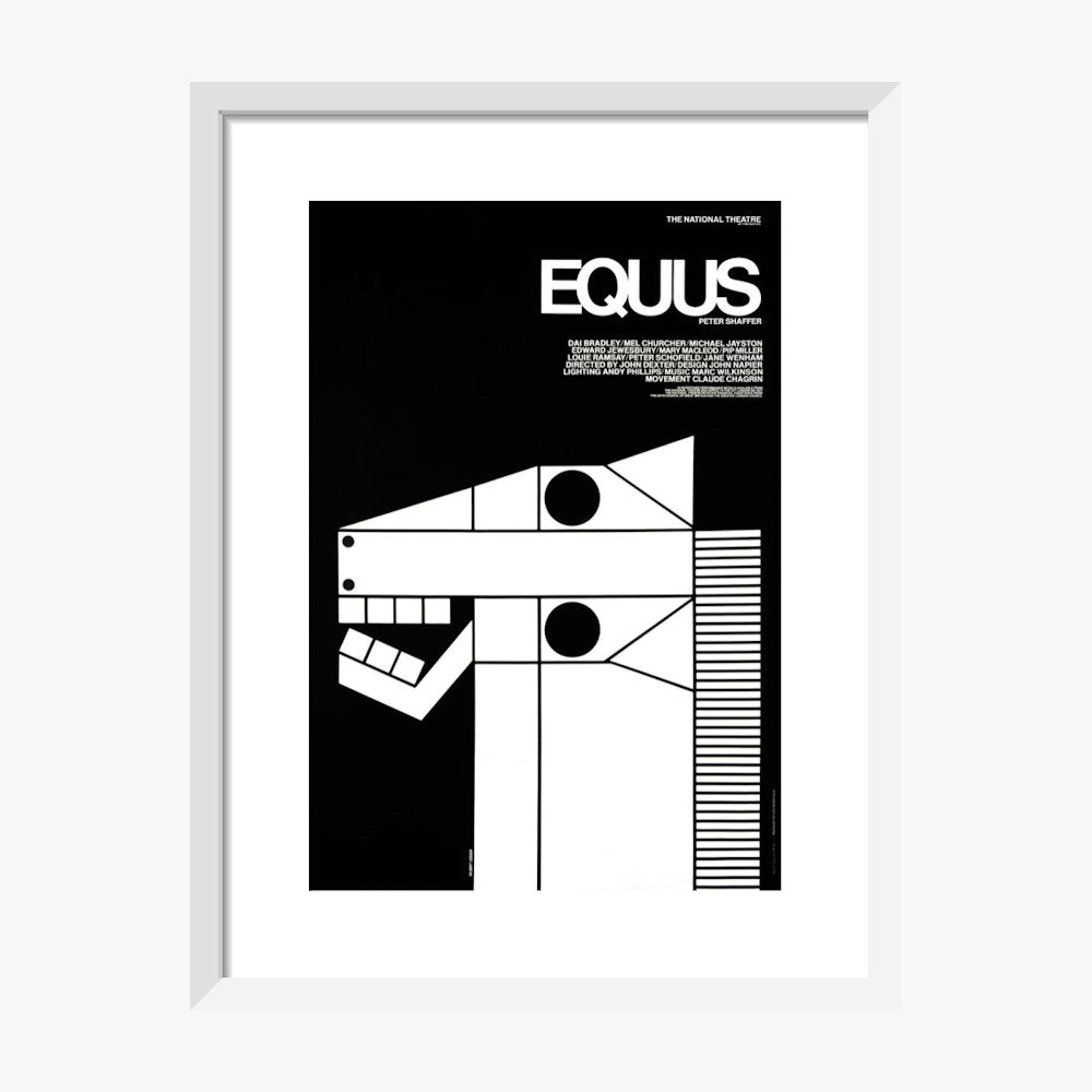
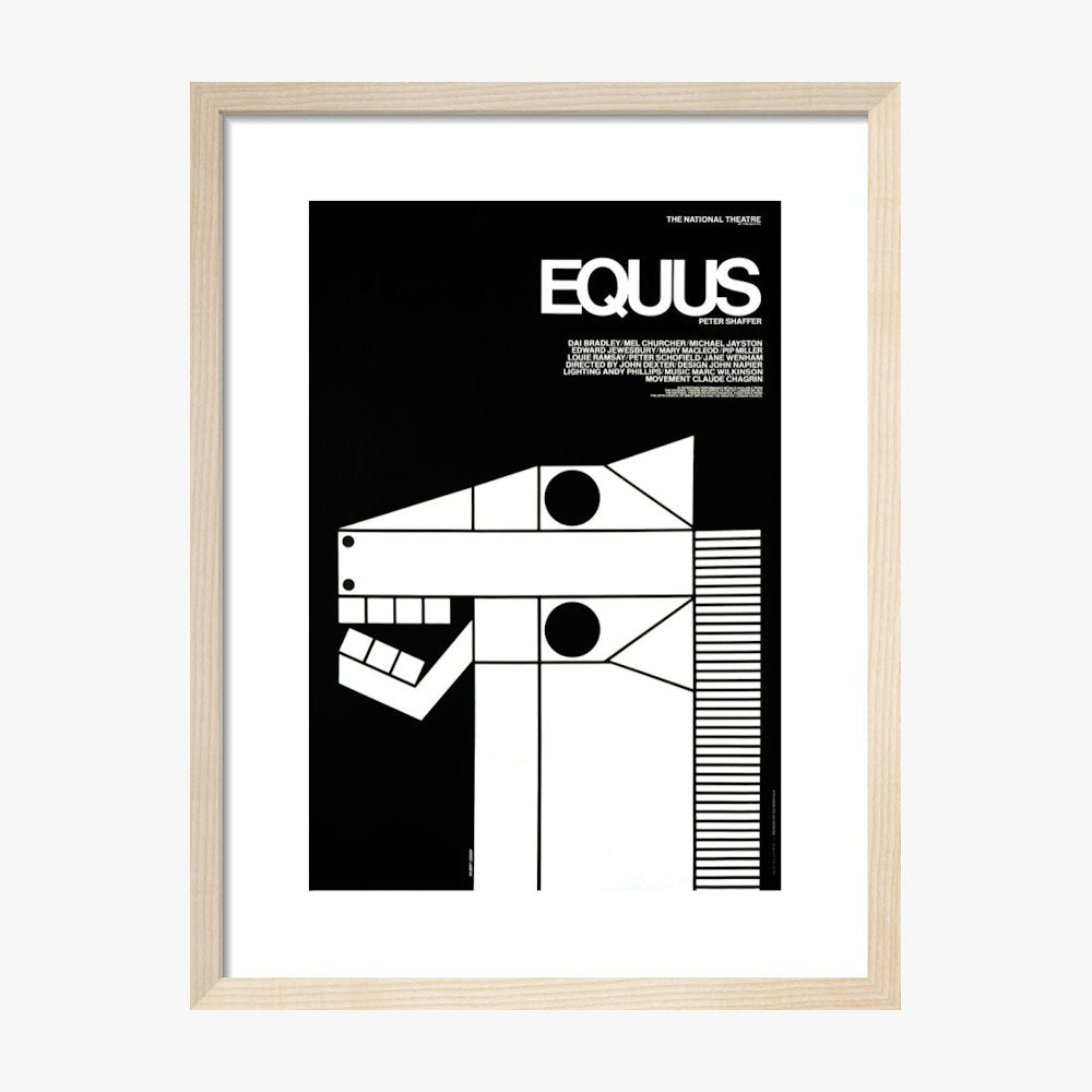
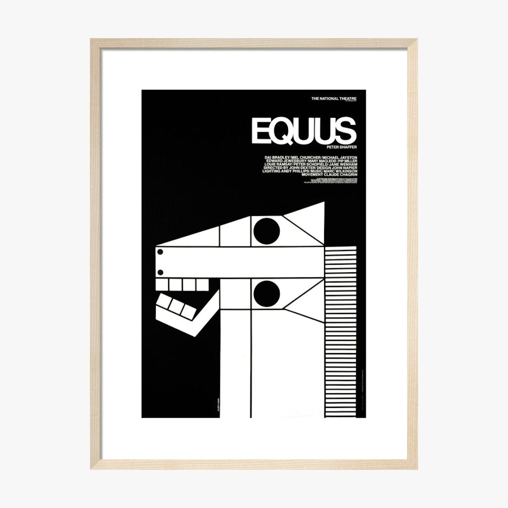
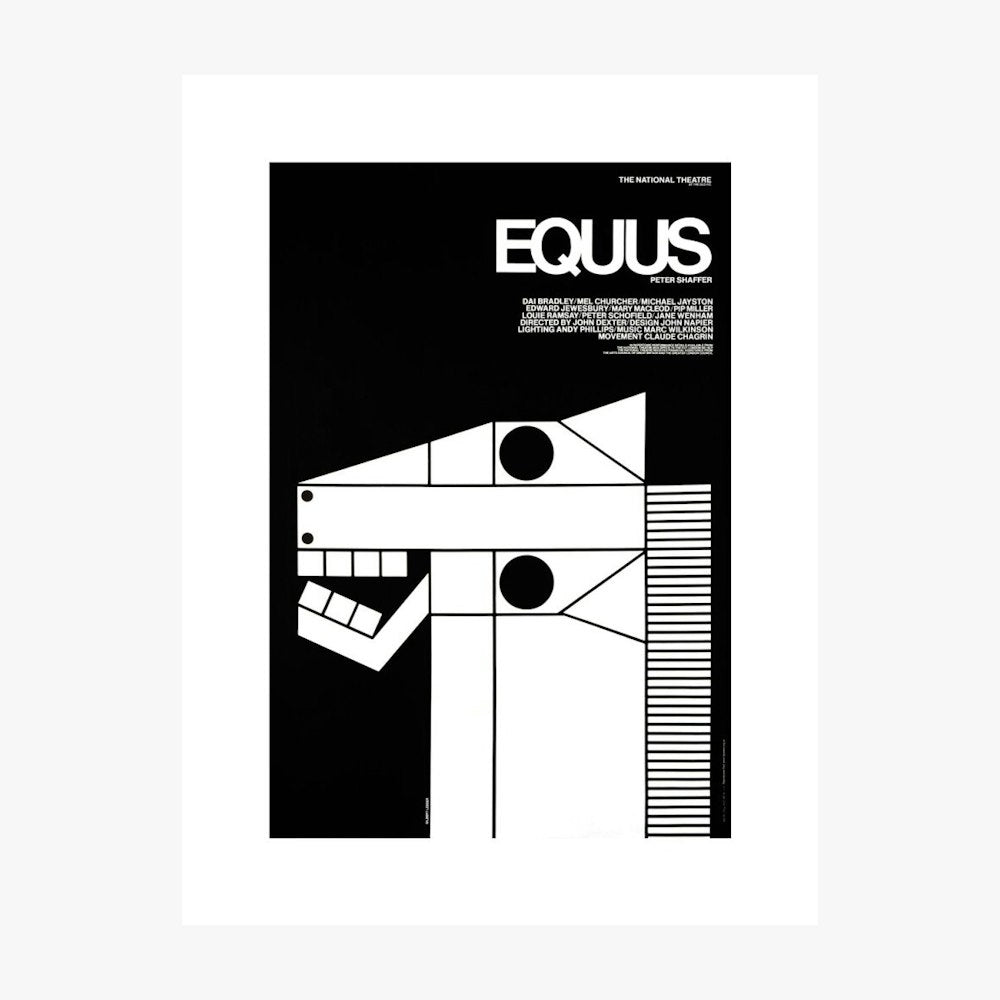
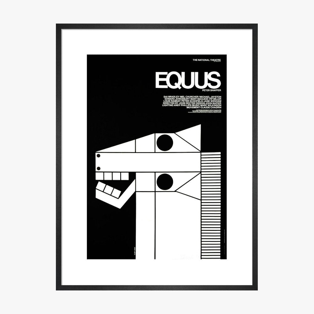
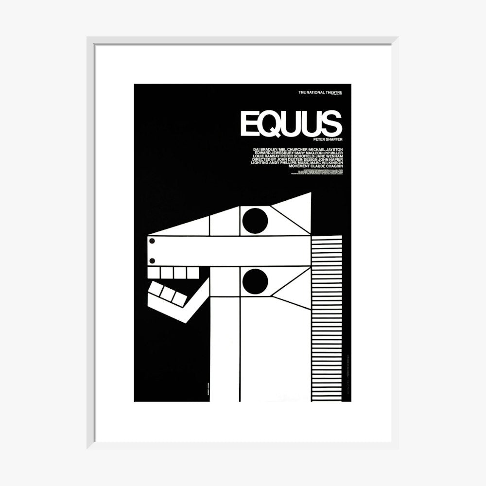
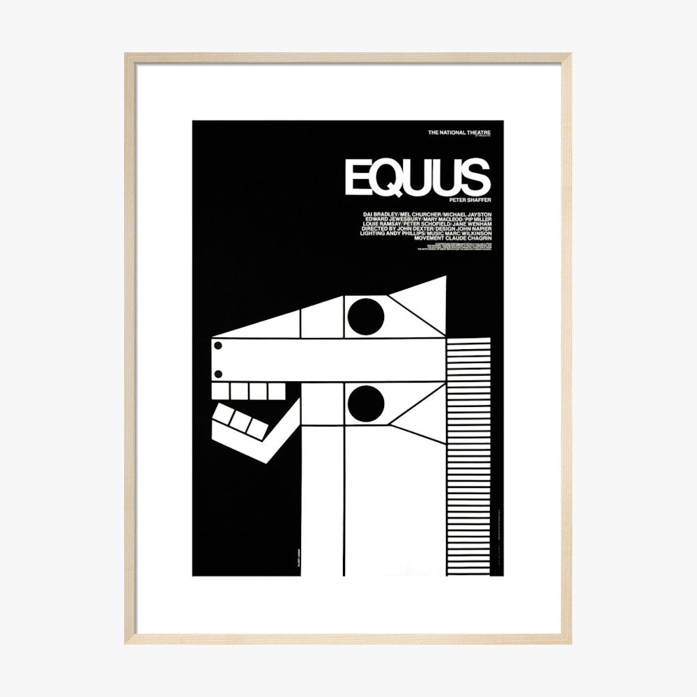
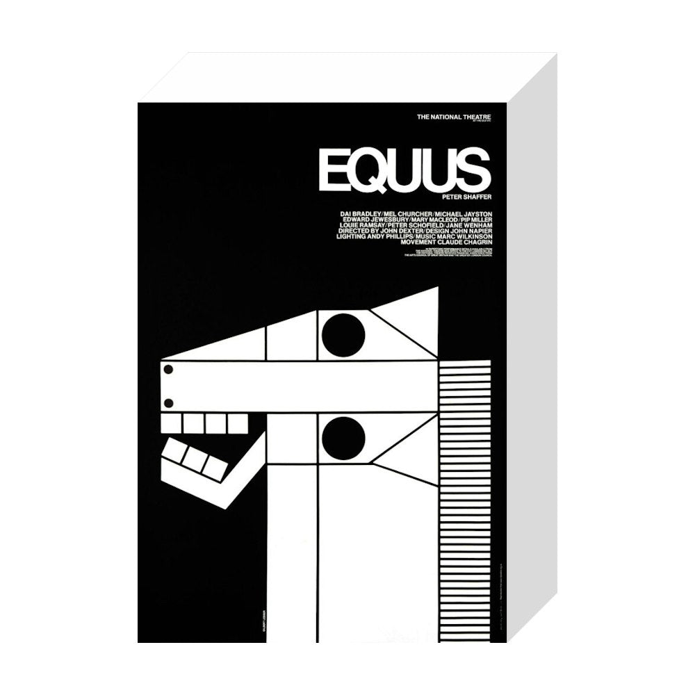
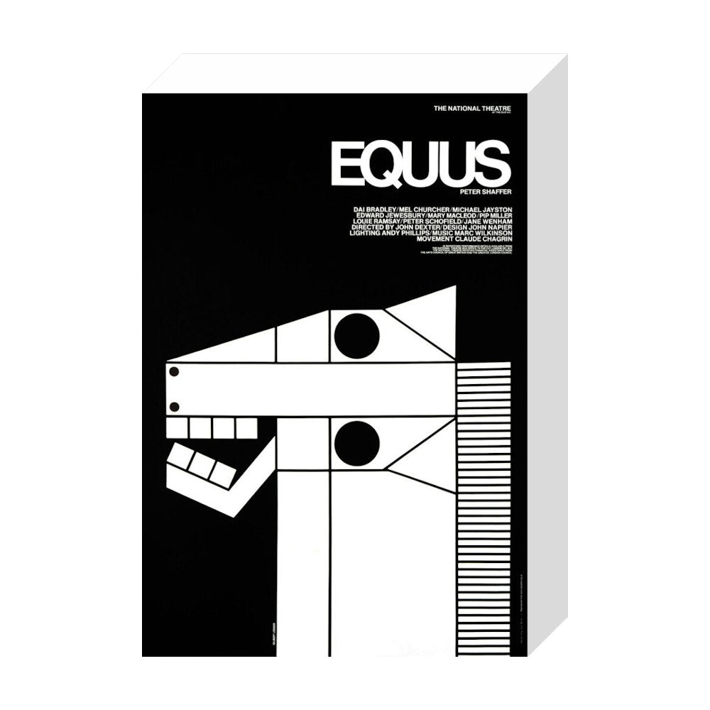
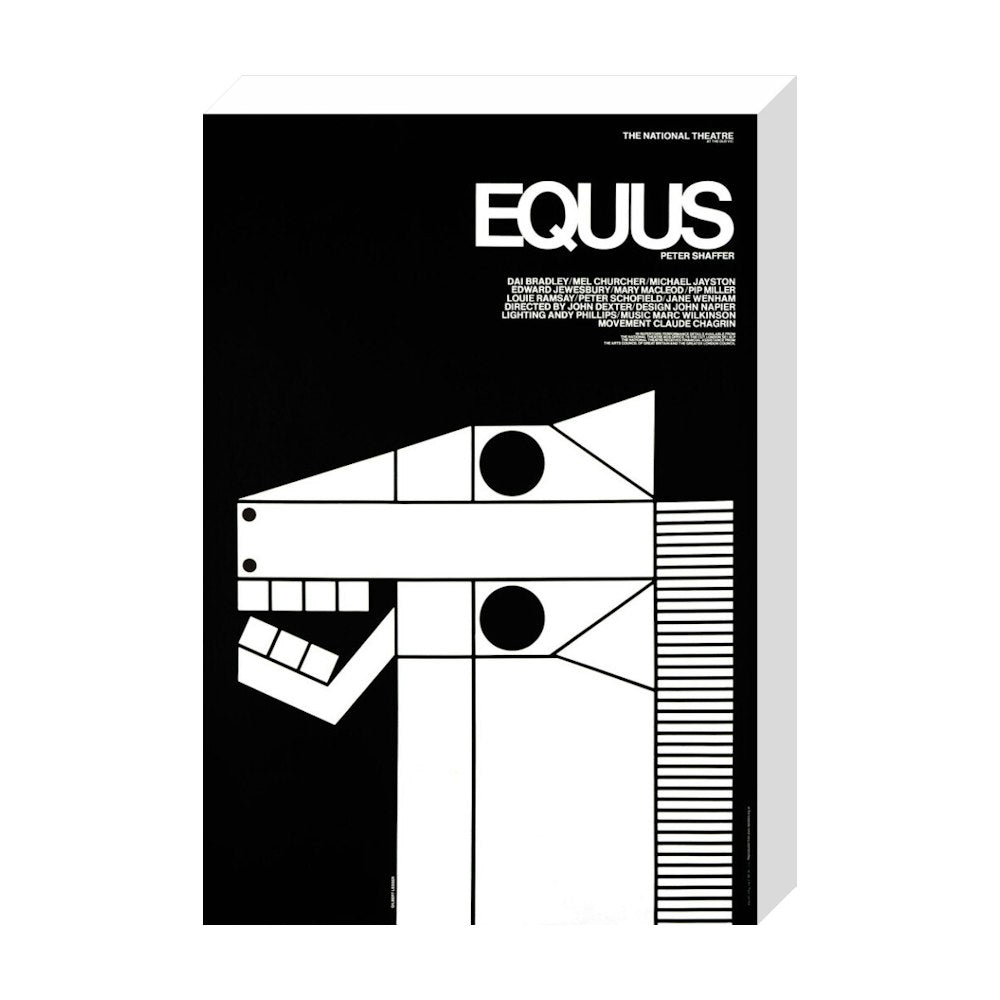
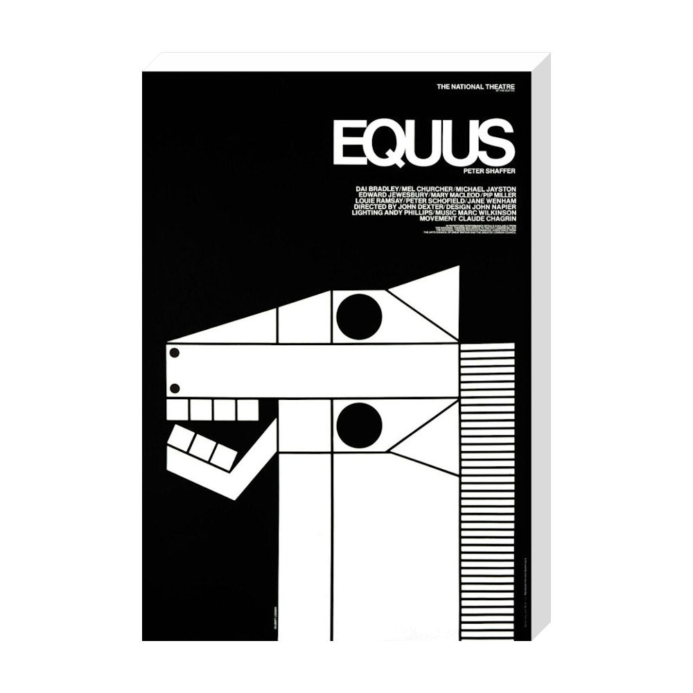
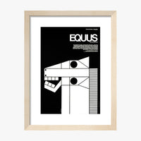
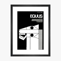
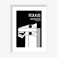
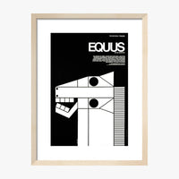
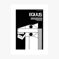
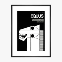
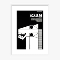
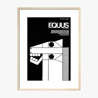
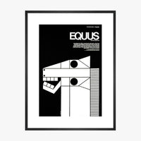
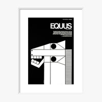
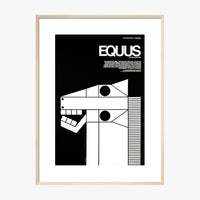
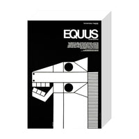
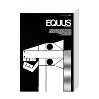
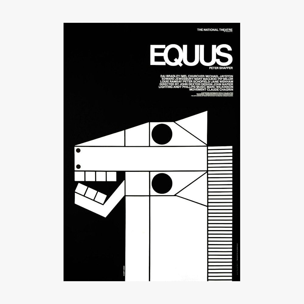
Equus, 1973. It simply speaks my visual language - a simple, striking and new view of a common subject using geometric shapes and pattern. Well observed and constructed, its minimal treatment is so inspiring, memorable and unique. The bold graphic style of its time is so suitable for poster artwork, and it conjures emotion and power.

Which is your favourite product we have developed? (so far!)

Pin badges, because you can’t beat a nice pin and I hadn’t designed for one before this brief. They are a very popular product and once worn proudly they can add to a person’s identity.

Three words that describe the National and why.

Sanctuary - my place to escape the crowds (and charge my phone :-)

Monolith - I love Brutalist architecture and the National is truly an iconic standing modern stone dedicated to all that is performed there.

Factory - It’s a fact that the National Theatre is one of central London’s unknown biggest factories that employs so many skilled people in order make a performance happen.